U.S. NEWS MONEY · MORTGAGE CALCULATOR
The 6.4%
Problem
Reframing a mortgage calculator into a 30-second guided estimate experience.
Simon Dai - Portfolio Case Study

BASELINE



Next-Action Rate
+0%
+0%
Why the Calculator Mattered

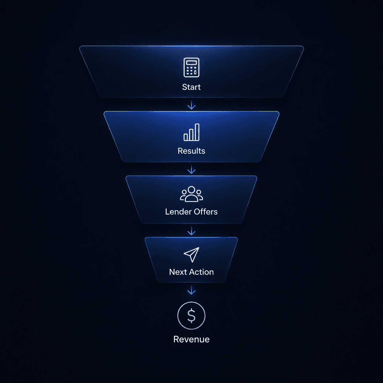
This was an ad-supported fintech funnel: when users reached a useful estimate, they were more likely to compare rates, view lender offers, and take a monetizable next action.
Design clarity directly affected business conversion.
USER
Get a useful mortgage estimate in 30 seconds without requiring financial expertise.



Fast
Simple
Confident
The Original Calculator Experience
The original calculator was functional, but it asked users to complete a dense form before they could see a useful estimate.
Users had to invest effort before understanding the value.
Where users dropped off
I paired product analytics with the original experience to understand where friction appeared in the journey.
46%
Started entering info
21%
Completed required fields
18%
Reached result screen
The first fix wasn’t enough
After early user interviews and usability tests, we decided to add more guidance around confusing mortgage inputs. The hypothesis was simple: if users understood the fields better, more of them would complete the calculator.
Why this decision
Users were hesitating around unfamiliar terms and exact financial inputs, so the first fix focused on reducing confusion through tooltips and clearer visual explanations.
Result
The improvement was small. Tooltips helped users who were already committed, but they did not reduce the larger barrier of time, effort, and trust before users started.
46% → 48%
Started calculator
+2 pts
21%→ 23%
Completed inputs
+2 pts
18% → 20%
Reached result screen
+2 pts
6.4% → 6.8%
Took next action
+0.4 pts
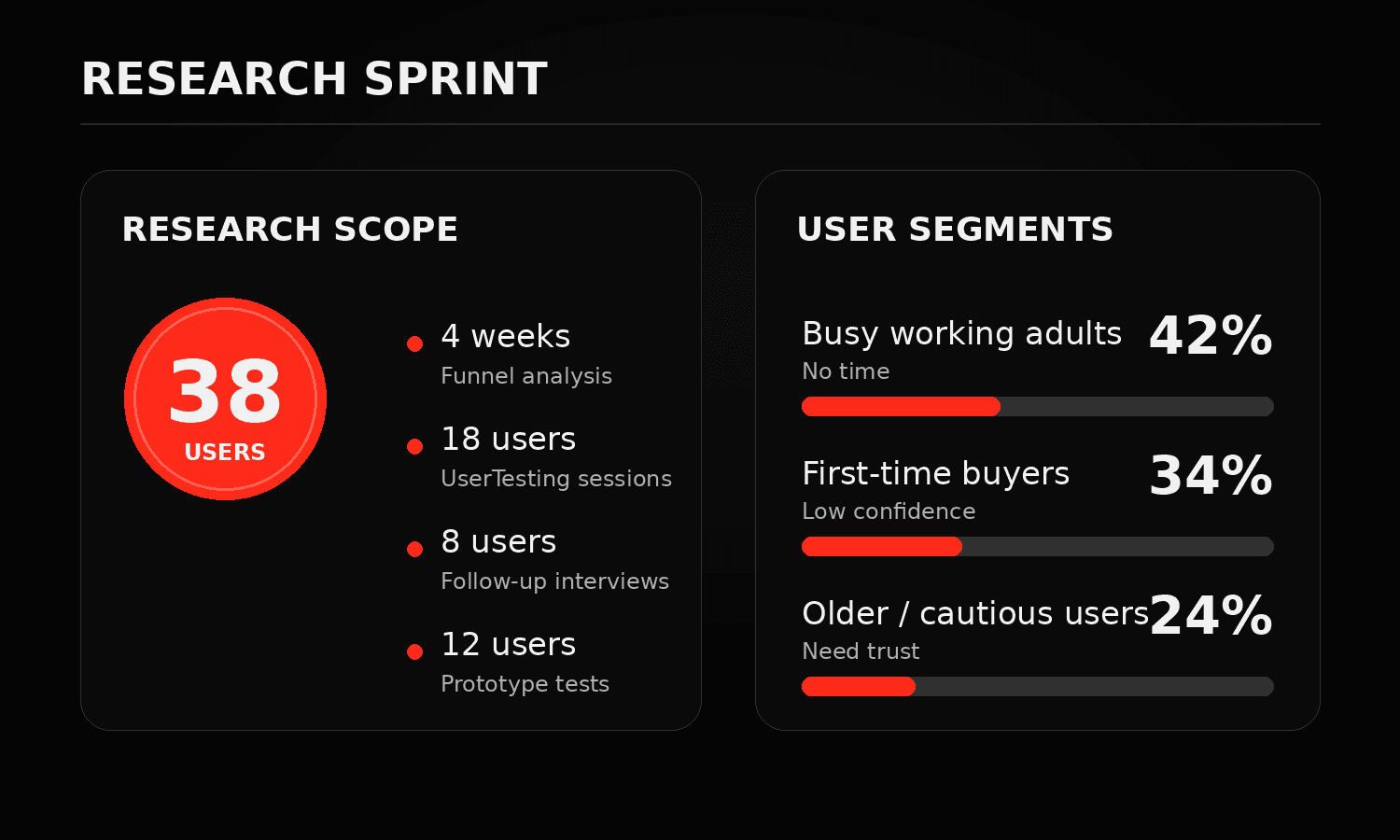
The Real Barrier Was Time + Trust
Users didn’t need more education.
They needed a faster, lower-risk path to a useful estimate.

Expected estimate within 30 sec
Hesitated at income / debt fields

Skipped Tooltips Education was too slow
Raised AI privacy concerns
The problem wasn’t comprehension. It was the cost of getting started.
Time · Trust · Effort
Raised AI privacy concerns
“This team fundamentally improved the way we run our operations. Onboarding now takes half the time, and the customer response has been incredible.”
Aiden Brooks
COO, Nexora Labs
Raised AI privacy concerns
“This collaboration reshaped how we work internally. Our onboarding process is twice as fast, and customer reactions have been overwhelmingly positive.”
Ethan Ward
Founder & CEO
From Research Signal to Team Strategy
After research, I aligned Product, Design, Engineering, and leadership around one focused strategy: keep the calculator logic intact, redesign the intake layer, and measure success by result-screen reach and next-action rate.

Scope
Keep calculator logic intact instead of rebuilding the core engine.

Product
Redesign the intake layer where users start, answer, and commit.

Trust
Make AI assistance transparent, editable, and low-risk.
Metric
Measure result-screen reach and next-action rate, not visual polish.
The chatbox was right — and wrong
What if AI asked the questions?
Prototype signals (12 tests + 8 interviews)
Preferred guided help
75%
Understood assistant
83%
Comfortable sharing exact income / debt
33%
Wanted review / edit
92%
Raised privacy concerns
50%
Design direction
Keep the guidance. Structure the input.
AI could guide the experience, but sensitive financial inputs needed to stay structured, visible, and editable.
Map the journey first
Design implication
AI should guide the journey, not own the conversation. The right pattern was a structured flow where guidance, input, and control happened at the right moments.

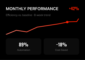

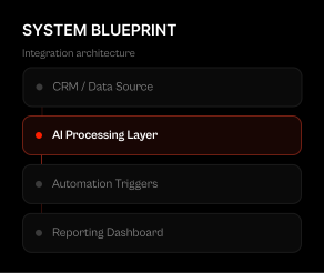
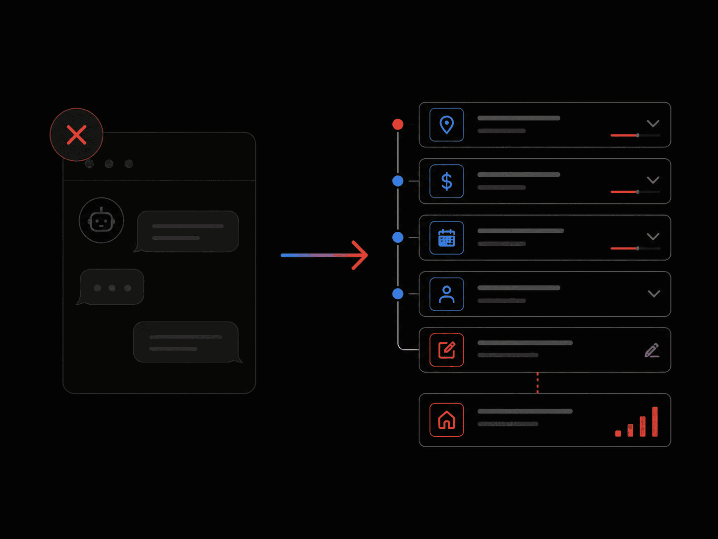
DECISIONS THAT CHANGED THE PRODUCT
We created a guided entry point that helped users estimate faster, understand assumptions, and stay in control before calculating.
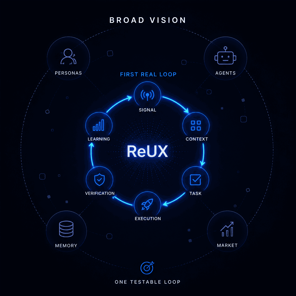
DECISIONS THAT CHANGED THE PRODUCT
The final solution came from four product decisions: where AI should appear, how much information users should provide upfront, how much control they needed, and what we could ship without rebuilding the core calculator.


Kill the Chatbox
Users liked guidance, but 50% raised privacy concerns. We kept the intelligence and removed the conversational interface.

Use Ranges First
Exact income and debt fields made users hesitate. Range-based questions made the first step feel easier and safer.

Show Editable Assumptions
AI could suggest defaults, but users needed to review and edit before trusting the estimate.

Keep the Core Calculator
We redesigned the intake layer without rebuilding the calculation engine, which made the solution faster to ship.
From 6.4% to 13.8%
The final Guided Quick Fill prototype gave users a lighter way to start, review assumptions, and reach a useful estimate before taking the next step.
Final prototype
46% → 48%
Started calculator
+2 pts
21%→ 23%
Completed inputs
+2 pts
18% → 20%
Reached result screen
+2 pts
6.4% → 6.8%
Took next action
+0.4 pts
AI Is a Complexity Decision
Connect the System
The strongest design decisions came from treating user confidence, product completion, and business conversion as one connected system.
Make AI Feel Invisible
The best AI pattern was not a visible assistant. It was guidance embedded into the workflow, reducing effort without creating new trust concerns.
Kill the Wrong Idea
The chatbox had signal, but the data showed it was the wrong interface. I kept the user need and changed the solution.
Why Tomo
Tomo is solving the same kind of problem this project taught me to care about: helping people make high-stakes financial decisions with more clarity, speed, and confidence.
I would bring a product design approach that connects user trust, AI-assisted workflows, and business outcomes — especially in the first-estimate moments where confidence either builds or breaks.