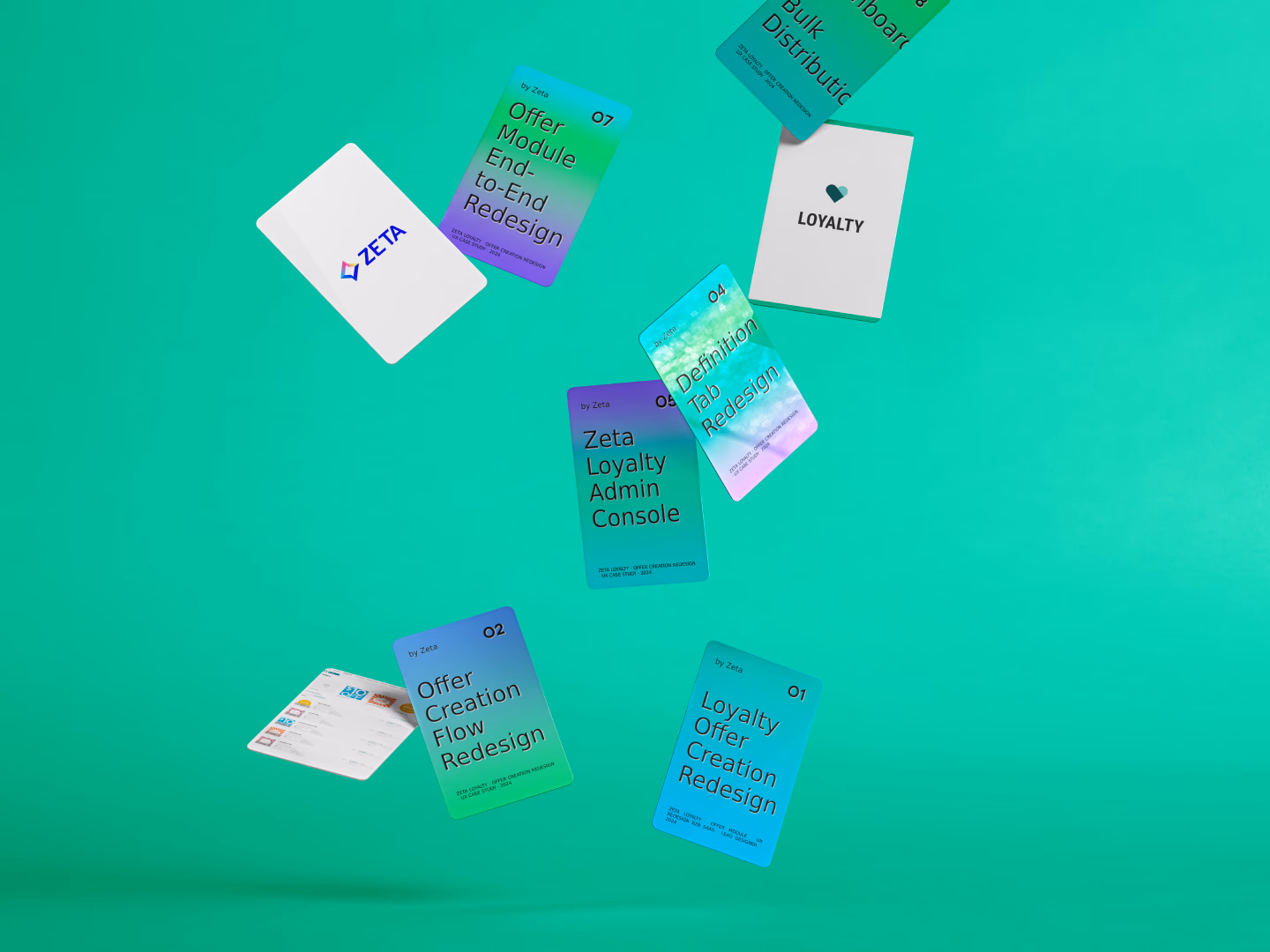
Zeta Loyalty Offer Creation Redesign
After Zeta acquired Marigold’s loyalty business, Marigold Loyalty became a core part of Zeta’s enterprise marketing ecosystem. The platform helps brands manage customer loyalty programs, including the offers that drive member engagement — discounts, coupons, rewards, and promotional incentives.
However, the Offer Management experience had never been redesigned as an end-to-end workflow. Creating an offer was fragmented, editing relied on scattered modals and tabs, performance data was hard to find, and operators had no efficient way to distribute offers at scale.
My role was Lead Product Designer, partnering with Product to define scope, explore directions, and drive the solution from concept through production.
01 / The context
The thing nobody wanted to talk about
When I joined the Marigold Loyalty team, the Offer module had been a known pain point for some time. Operators — the brand managers and loyalty program administrators who use this platform daily — had filed feedback. The product team had logged the issues. But the fixes had never been scoped, prioritized, or designed in any coherent way.
The business goal behind this redesign was specific: improve the efficiency and reliability of the Offer creation workflow to strengthen platform value for operators, and reduce friction that contributes to churn risk.
02 / Research
Five problems, one root cause
My first move wasn't to open Figma. I conducted in-depth interviews with operators from Baby Bunting, Starbucks, and Pizza Hut, then spent time with the findings — not to catalog complaints, but to understand what they had in common.
The issue was not a collection of small UI failures. It was a workflow that had grown without one clear operating model.


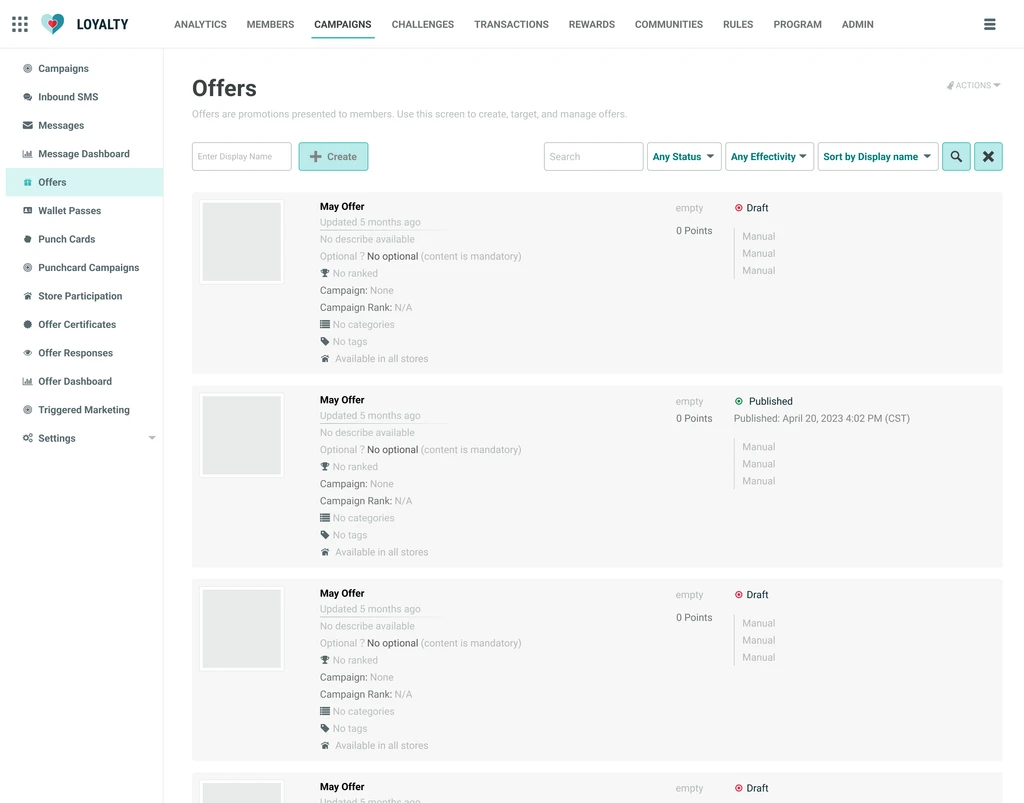
A fragmented two-step flow.
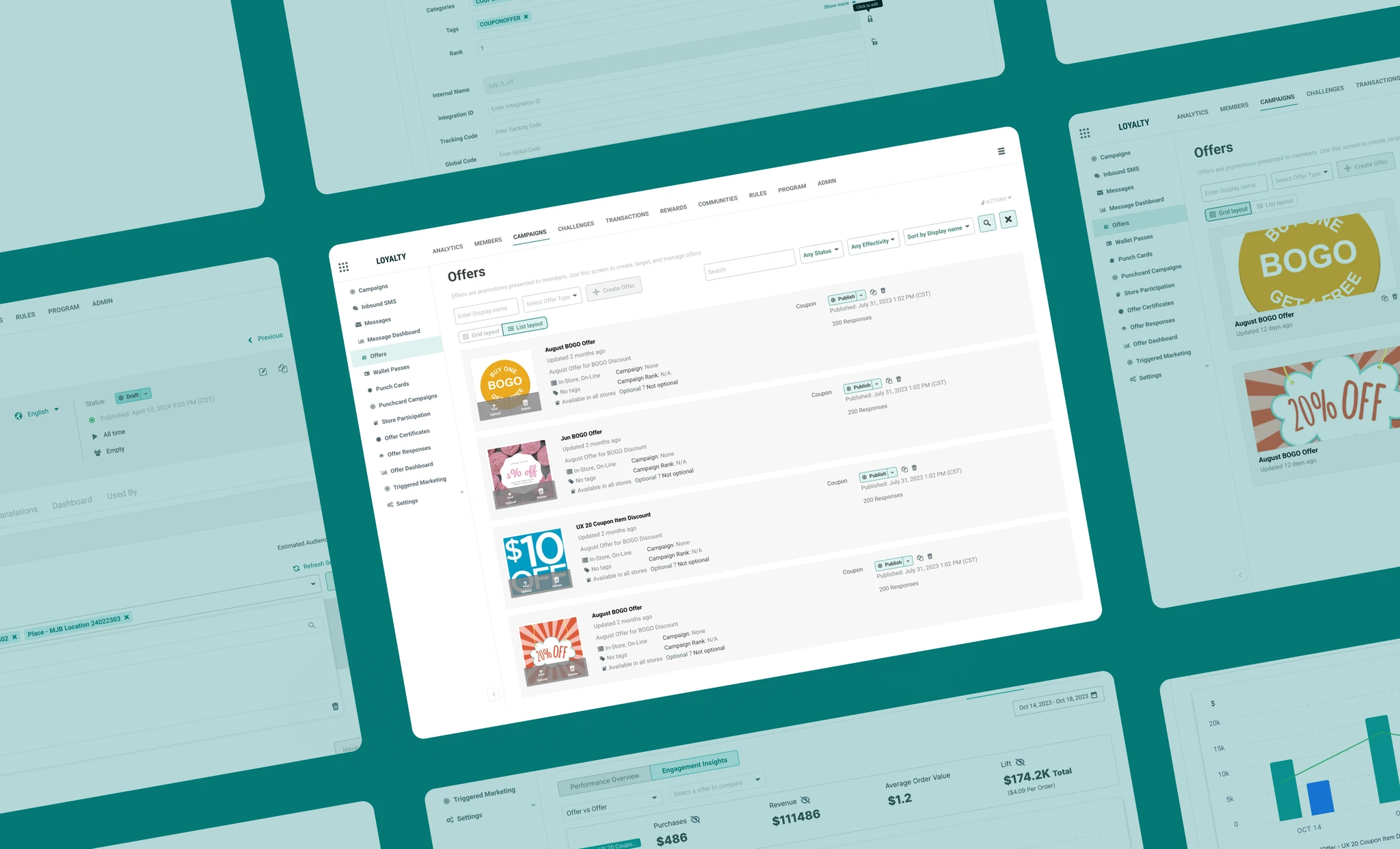
Creating an offer ended in a list, not in the offer itself. Operators had to find what they had just made every single time.
No efficient way to browse and locate offers.
A dense single view made large offer libraries slow to scan, compare, and search.
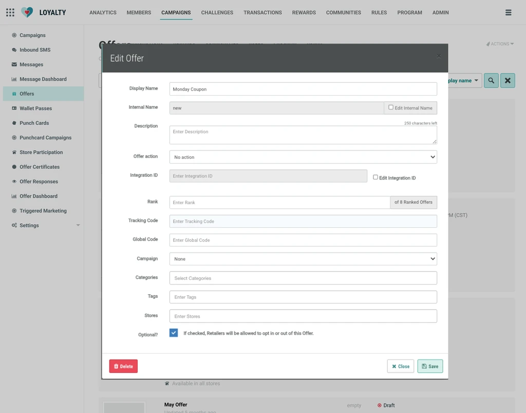
Silent data loss in Qualifying Items.
Critical configuration data could disappear without clear save feedback, making the workflow feel unreliable.
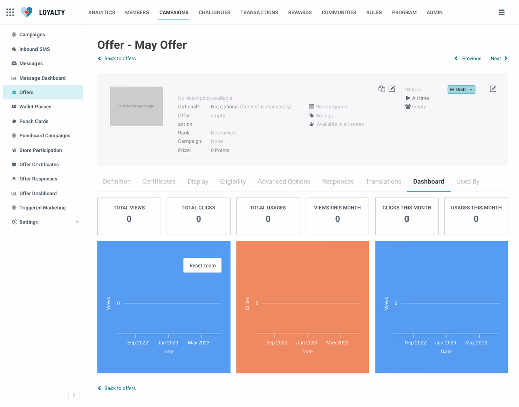
No performance visibility.
The dashboard did not tell operators whether an offer was actually working.
No way to send at scale.
Manual distribution could not support enterprise operators managing hundreds of thousands of members.
03 / Insight
What the problems revealed
None of the five issues were isolated bugs. Each piece had been built independently, by different people, at different times. The Offer module had never been designed as a system.
Broken continuity, not missing features
What an operator did in one step was not carried into the next. The real fix was restoring continuity across the workflow.
A loop the product only half-supported
Operators need to create, launch, monitor, adjust, and redistribute. The product only reliably supported the first step.
Unpredictability breaks trust faster than friction
Slow tools can be learned. Disappearing data and ambiguous saves destroy trust in the system.
04 / Validation
Testing direction without waiting for users
Before committing engineering resources, I needed directional validation. The challenge: direct access to operators — brand managers at enterprise companies — is logistically difficult. Scheduling even a 30-minute session can take weeks of coordination.
Rather than waiting, I made a deliberate call: design two distinct directions and run a structured cross-functional review. Both solved the redirect problem. The difference was how much friction and uncertainty remained after creation.
Option A
Preserved a light view/edit separation. Fields from the removed modal moved into the offer's top panel, with an edit mode for detailed configuration.
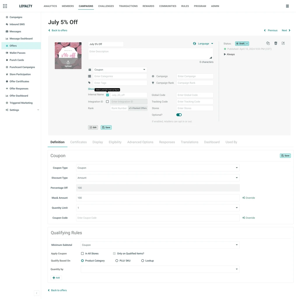
Option B
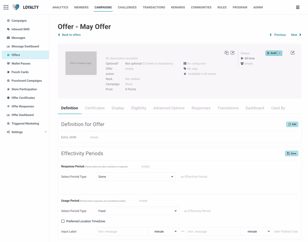
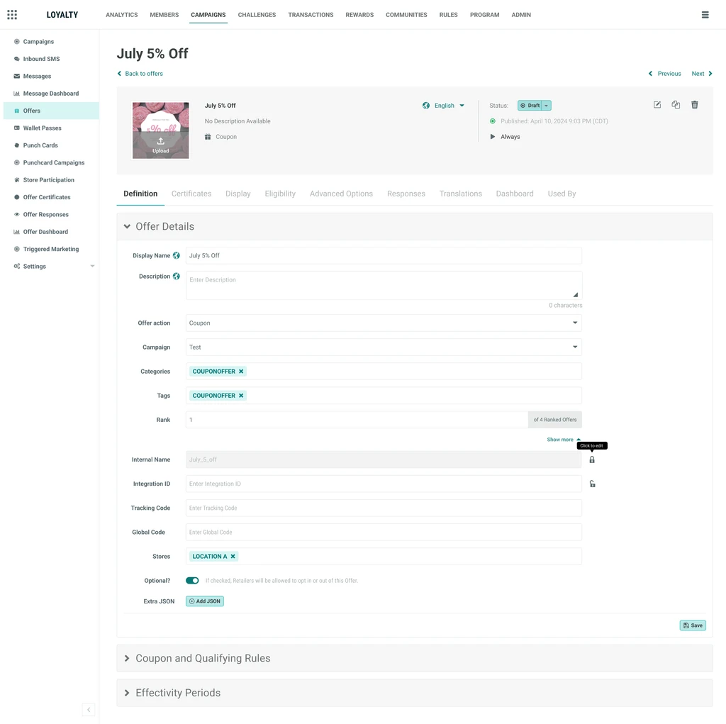
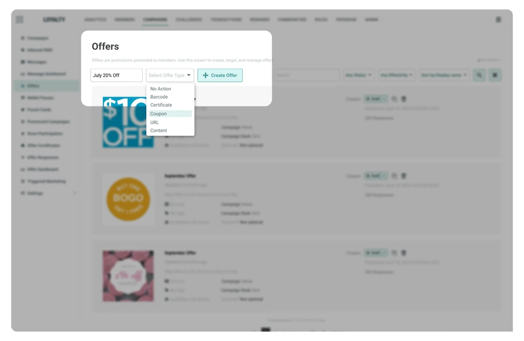
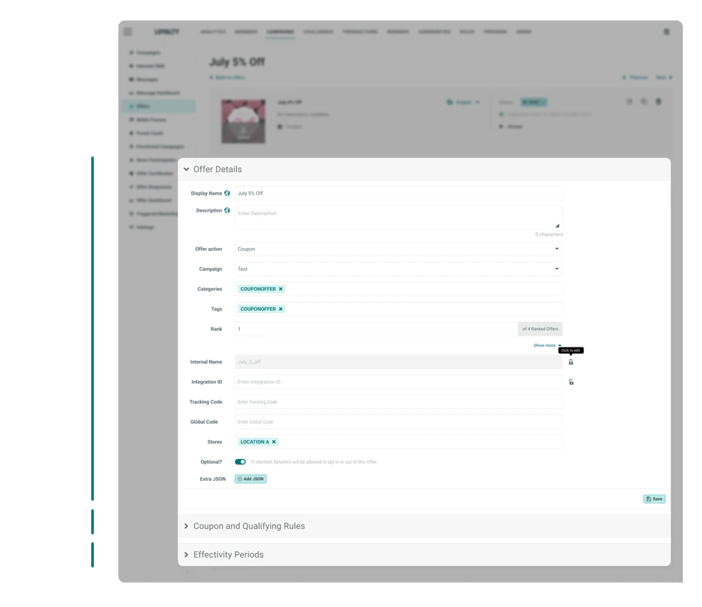
Eliminated edit mode with direct, in-place configuration. Fields in the Definition Tab were directly editable in collapsible sections, each with its own Save button.
AI-generated prototypes, not static screenshots
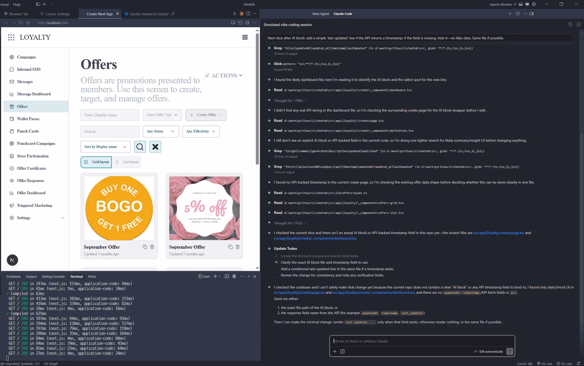
To make the review concrete, I used Claude Code + Cursor to generate interactive prototypes of both options in a few hours — reviewers experienced the two interaction models directly instead of evaluating concepts on paper.
A structured survey then gave 17 PMs, engineers, customer success managers, and product specialists the design rationale before review.
The result was clearer than I expected
72.7% chose Option B (11 of 17 respondents). The qualitative feedback converged on three themes — and notably, they mapped directly onto the three insights I'd developed:
- Fewer steps to reach configuration — Option B's direct-entry model eliminated unnecessary steps between creation and configuration.
- Collapsible sections reduce scroll and cognitive load — keeping the active section in view matched how operators actually work.
- Stronger consistency with the broader product system — Option B aligned better with established platform patterns, reducing learning cost.
Option A
Option B
“Workflow is more explicit — Option A's coupon details location feels like metadata, not higher-level campaign details.”
“More intuitive and user-friendly — especially the collapsible sections in the Definition Tab.”
“Allows direct entry into the offer after creation, with collapsible sections keeping the active area in view.”
“Collapsible sections on Option B could be made more visually obvious.”
05 / Decisions
What moved into the final product
Kill the redirect
After creation, operators enter the offer directly instead of being dropped back into a list.
Redesigned list with dual view
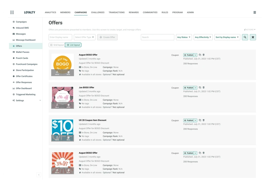
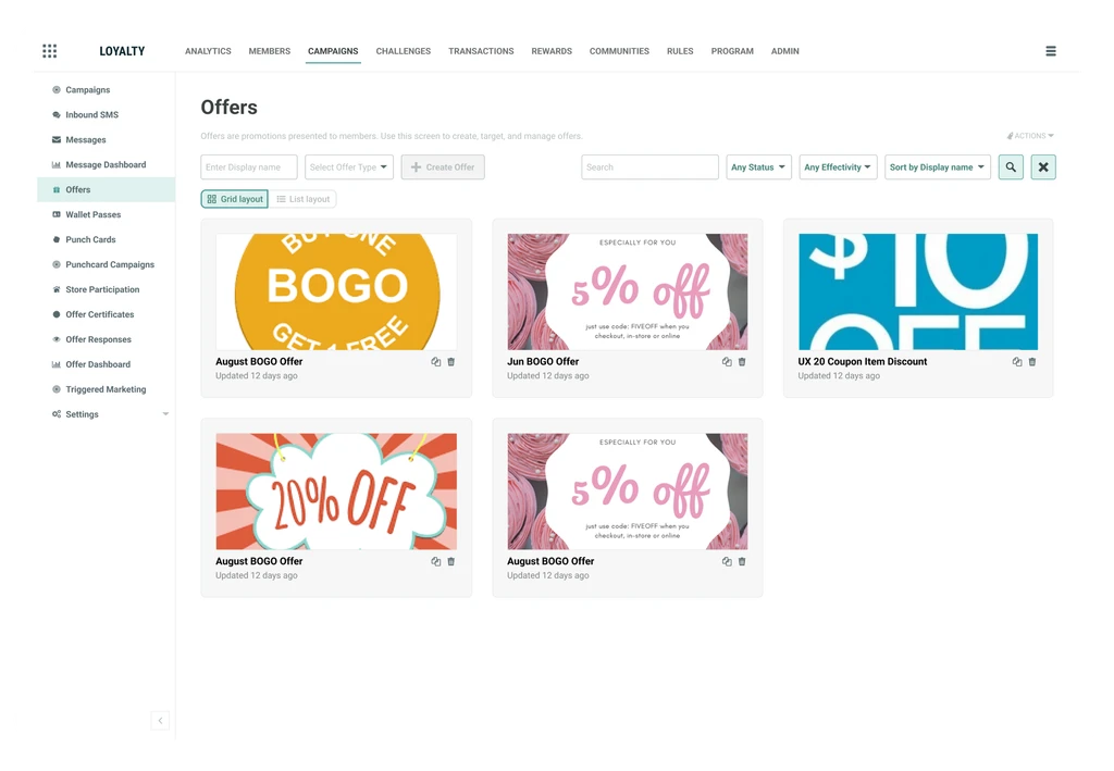
Grid view supports fast visual scanning; list view preserves metadata for comparison and filtering.
One page, explicit saves
Collapsible sections make the Definition Tab one coherent workspace with clear, scoped save actions.
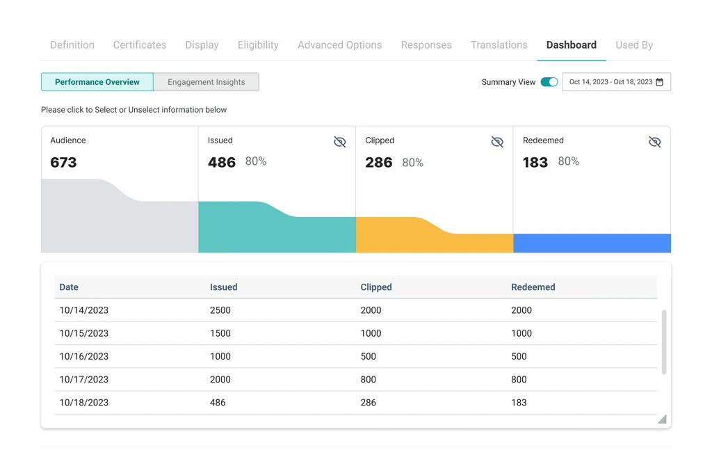
A dashboard that drives decisions
Every metric answers an operator question: is this offer working, who is using it, and where?
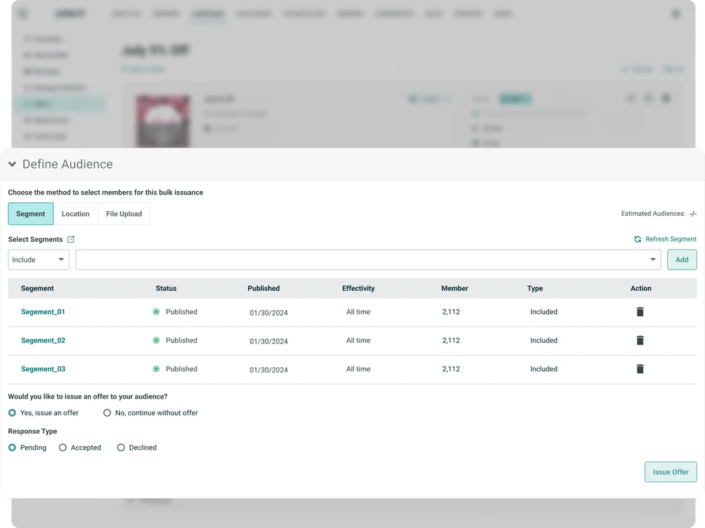
Bulk send with a deliberate pause
A confirmation step gives operators a moment to verify an irreversible high-scale action.
06 / Outcome
What happened after handoff
Designs went to engineering in July 2024. My PM conducted two formal acceptance review rounds before the feature shipped — structured, documented, covering all six offer types across 130-plus test cases. I stayed close to both.
07 / Usability
Outcome — what the usability testing showed
To validate the redesign before scaling it, we ran a usability test with 6 internal users — customer success managers and implementation specialists who work with operators daily.
“Finally I can see exactly what's happening with each offer. Before the dashboard gave me almost nothing to work with.”
“The task is much easier to explain to an operator now. The system makes the next action clear.”
“The section-level save behavior takes the guesswork out of configuration.”
“I can scan an offer, understand its status, and decide what to do without digging through screens.”
08 / Closing thought
A closing thought
I came into this project thinking about it as a usability problem — reduce steps, fix bugs, clean up the flow. I left with a more specific frame: B2B operators don't need delightful products. They need reliable ones.
What erodes trust in a B2B tool isn't friction. Friction can be learned and tolerated. What erodes trust is unpredictability — data that disappears without warning, actions that produce unexpected results, a save that maybe worked and maybe didn't.
Every design decision in this project was, underneath, a trust decision: can the operator predict what this system will do? Can they build their daily work around it without second-guessing it? That turned out to be the right question to be asking.
09 / Try it
Try it — built with AI, not just designed in Figma
This is a working prototype built with Claude Code + Cursor, not a static mockup. You can walk through the offer creation flow, explore the redesigned Definition Tab, and see the dual-view list in action. It's the same design you just read about — now interactive.
Try the Prototype ↓
Offers
Offers are promotions presented to members. Use this screen to create, target, and manage offers.
Updated Jul 18

Updated Jul 11

Updated Today, 9:42 AM

Updated Jul 16

Updated Yesterday
.say hello