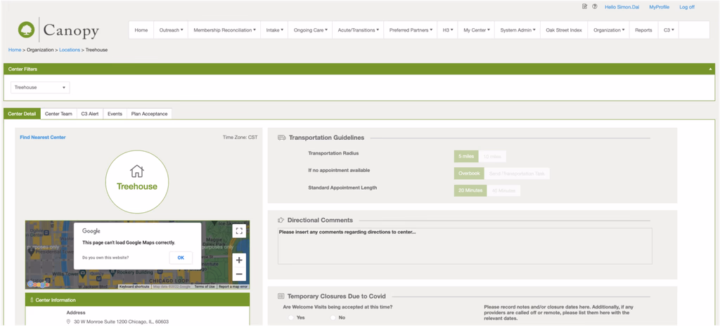
EMR Document Review Canopy 2.0
Oak Street Health is a chain of primary care clinics dedicated to serving adults aged 55 and older across multiple U.S. states. During my time there, CVS Health acquired the company — and along with that transition came the need to modernize Canopy, Oak Street's in-house EMR system, which had been built and deployed without prior user research.
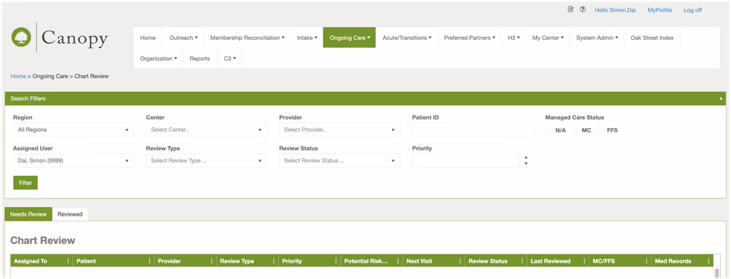
I was brought in as the sole UX designer on the Document Review module — a core workflow where nurses and medical assistants review patients' historical records before each clinical visit.
The System Nobody Wanted to Use
Oak Street Health built Canopy in-house with the ambition of challenging the three dominant EMR systems in the U.S. market. They had secured significant funding, assembled an engineering team, and shipped a product. The problem: no user research was done before launch. No one asked the nurses, the medical assistants, or the doctors how they actually worked.
The result was a system that technically functioned but created friction at every step. Staff adopted workarounds. Paper persisted. And the Document Review module — the daily tool nurses relied on to prepare for patient visits — was among the most broken pieces of the experience.
Layered on top of this was the context of the CVS acquisition. Brand requirements mandated a shift from Oak Street's green color system to CVS red, with both logos coexisting in the interface. These weren't design choices — they were organizational constraints that had to be factored into every decision from the start.

Three things that made this harder than it looked
A domain with no playbook
Medical EMR is a highly specialized vertical. There were no comparable apps to reference, no obvious design patterns to borrow from. Every decision had to be grounded in clinical workflow research.
The workaround became the workflow
Clinical staff had been working around the system for so long that the workarounds felt like the actual job. Direct questions wouldn't surface the real problems.
Designing through an acquisition
CVS's brand requirements — color system, logo coexistence — had to be factored in from day one. Design decisions couldn't be made in isolation from the organizational shift happening around them.
We embedded ourselves in the clinics. Observation sessions, shadowing, structured interviews across every role that touched documents. The research replaced the playbook.
We stopped asking and started watching. Behavior showed us what interviews couldn't.
Brand constraints went into the design criteria on day one — not as a final handoff checklist, but as a shaping force from the start.
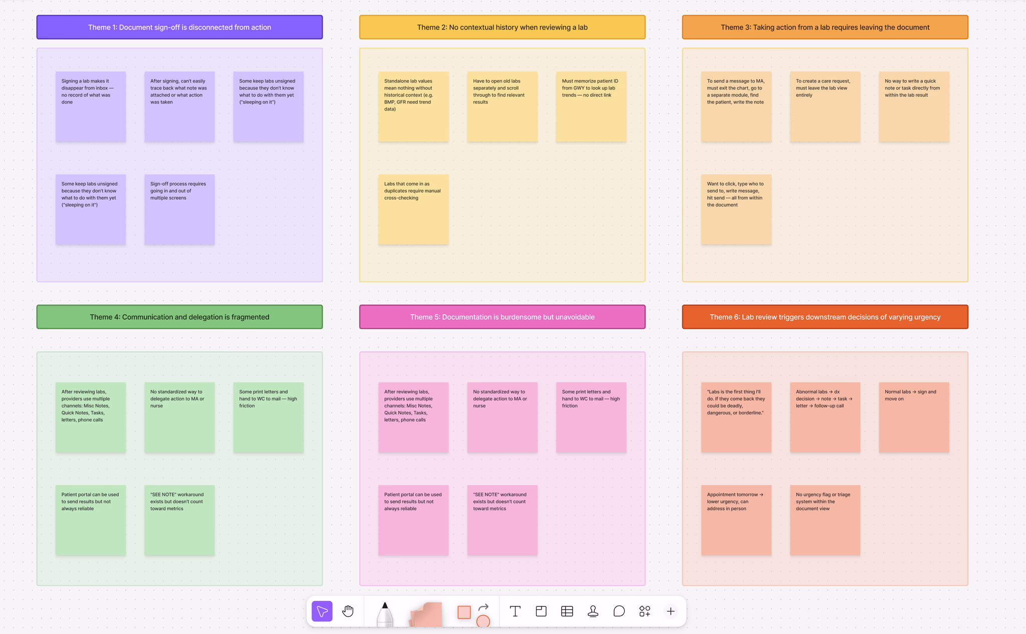
What I Saw That Users Didn't Say
We interviewed Welcome Coordinators, Medical Assistants, Registered Nurses, and Physicians across multiple clinic locations. The roles were different. The workarounds were different. But every single one pointed back to the same failure: the system had no way to hold context, so people built their own.
A nurse reaching for a notepad mid-review. A medical assistant with two systems open all day. A welcome coordinator printing an urgent fax and physically walking it to a provider because she didn't trust the digital flag to get there in time. A physician jumping between Canopy, Greenway, and Updox to complete a single document sign-off.
Rethinking This Step With AI
Synthesis is where AI earns its place in my workflow — the work is high-volume, the patterns are repetitive, and the output is a structured starting point I can actually pressure-test. Today I'd transcribe all interviews and use Claude to group quotes by role, flag workaround language, and surface recurring themes.
But the most important finding here wasn't in any transcript. It was the pause before the nurse answered — the hesitation that told me her behavior had become invisible to her. AI gets me a structured starting point faster. What that starting point actually means is still mine to figure out.
The person behind the broken workflow
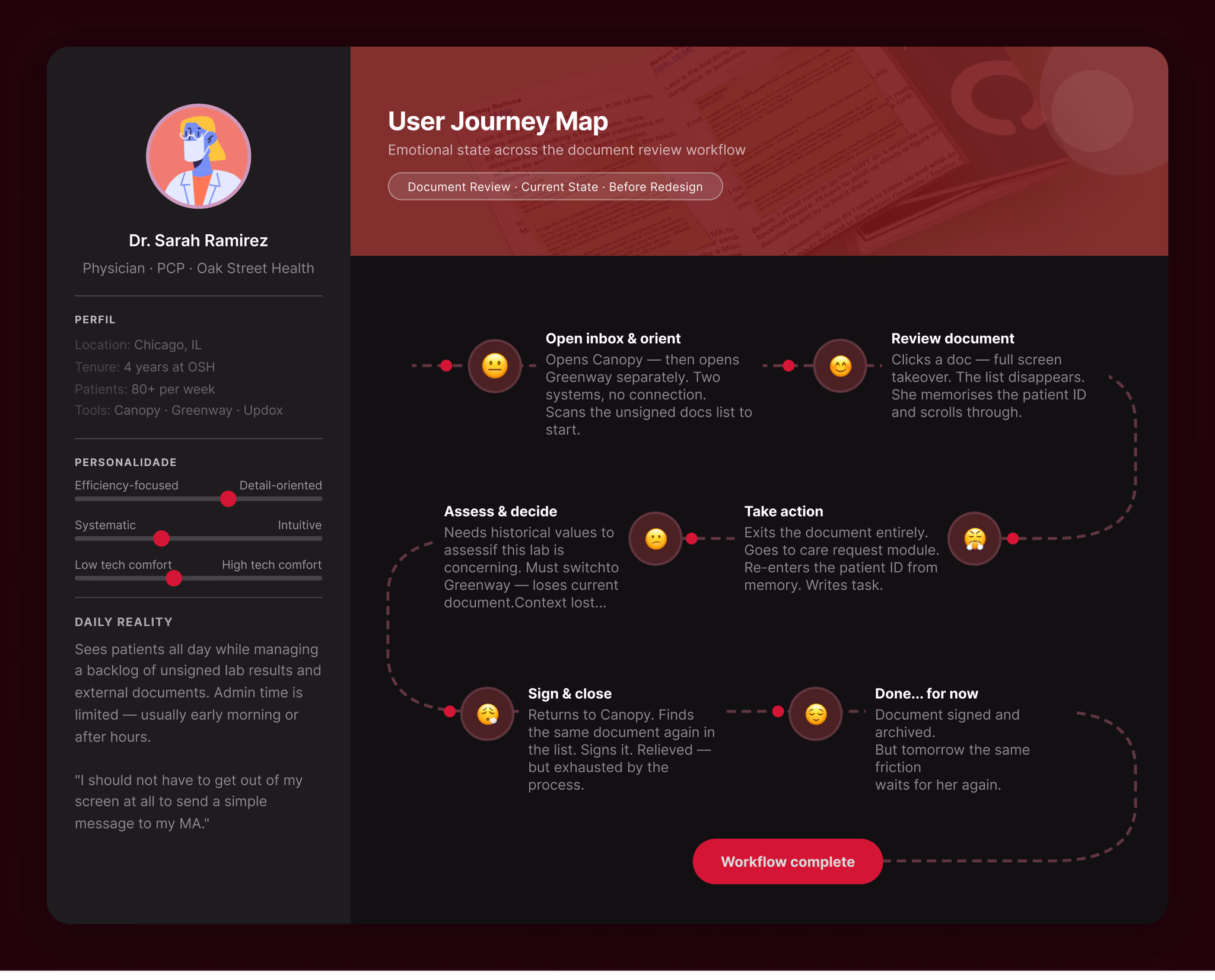
One user type kept surfacing at the center of every pain point: the physician.
To review a single document and take action, she had to move across three separate systems, remember patient IDs between screens, and complete sign-off through a module with no connection to the document she'd just reviewed. The pain wasn't in any single step — it was in how many steps there were.
She wasn't asking for a better interface. She just wanted to stop losing time to a tool that was supposed to help her.
The real problem was hiding underneath
Stay in one place.
Every action — viewing, referencing history, signing off — should be completable without leaving the current context.
Fix it at the architecture level.
Two tools for one logical task was a structural problem. Redesigning the interface wasn't enough — the information architecture had to change.
Serve all roles through flexibility.
One shared workspace. Different working styles accommodated through configuration, not through building separate products for each role.
The system forces users to maintain context outside of itself — on paper, across multiple tools, from memory — because it has no mechanism to hold state, compare information, or let users act without breaking their flow.
Before anything was decided, we filled a lot of sticky notes
Before we touched any design tool, the team got into a room and put everything on the wall.
What barriers exist? What does the current workflow actually look like? Where does responsibility hand off between roles? What are we solving for — and what are we not?


The mess was the point. By the end of the session, three things had become clear: the problem lived at the workflow level, not the interface level; the scope needed a hard boundary or it would expand indefinitely; and the physician was the user whose pain was blocking everything downstream.
Those three things shaped everything that came after.
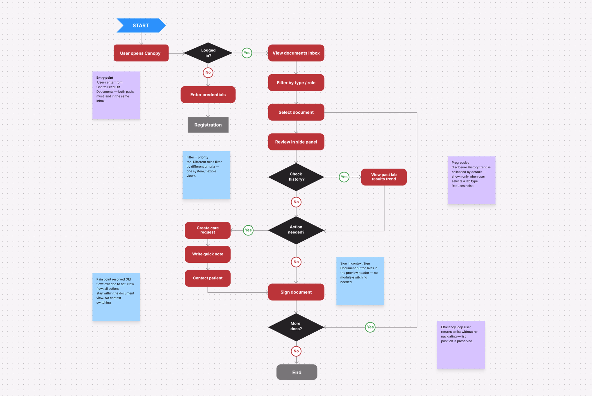
Three decisions that changed everything
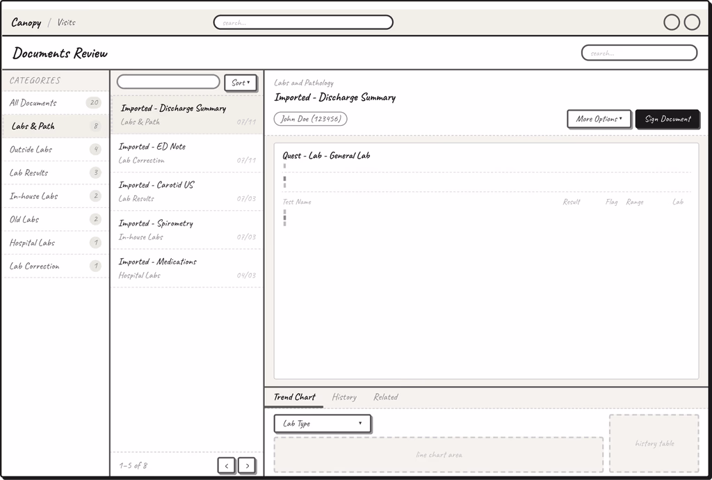
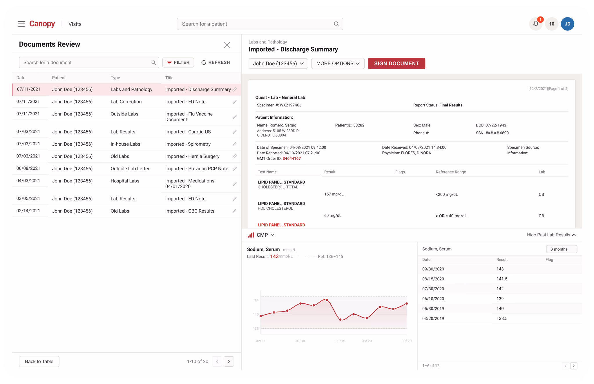
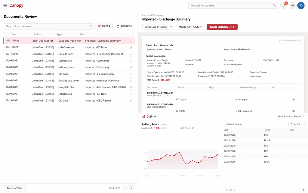
Side panel preview
Click a document, it opens on the right. The list stays on the left. Users move through their queue without ever losing their place. The list never leaves. That was the only criterion that mattered.
Past lab results, on demand
Physicians needed historical context, but showing everything all the time creates noise. A collapsible section lets users select a lab type and pull up trend data across 3 months to 2 years. There when you need it. Gone when you don't.
One inbox, flexible filters
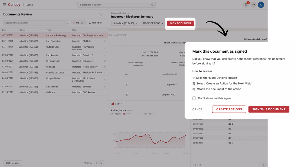
External faxes and internal lab results merged into one page. Filters by type, date, priority, and role let each user work their own way — no separate interface for each. Sign Document moved into the preview header so physicians never have to leave the document to sign it.
What we learned before we called it done
Before committing to high-fidelity, we built lo-fi prototypes in Axure and tested them with clinical users. The goal wasn't to validate that we were right — it was to find out where we were wrong before it was too late to change anything.
We ran usability testing through an external platform, recruiting clinical staff who matched our target user profile. We gave them real tasks based on the actual workflow — find a document, review a lab result, complete a sign-off — and watched where they moved confidently and where they didn't.
Rethinking This Step With AI
During lo-fi iteration, I'd define evaluation criteria from the research — list visibility, filter discoverability, preview readability, sign-off accessibility — and use AI to generate a structured comparison of layout options against those criteria. Writing that table manually takes thirty minutes. With AI doing the first pass, I spend that time actually evaluating instead of formatting.
The core interactions held up. But two things surfaced that we hadn't fully accounted for.
Filters weren't communicating their state.
Once users applied filters, they couldn't immediately tell how many were active. We added a badge counter on the Filter button — a small change that made the system's state visible at a glance.
Past lab results felt static.
Some users didn't realize the section was interactive. We revised the copy and added a visual affordance to make the interaction obvious before anyone had to figure it out.
Neither finding was a fundamental flaw. Both were signals that the interaction needed to explain itself more clearly.
The system finally gets out of the way
Everything we learned from research, every decision we debated, every constraint we worked around — it all came down to this: a single page where clinical staff could do their job without the system getting in the way. No more switching tools. No more losing your place. No more printing documents to sign them.

View without losing your place
In the old system, opening a document meant losing everything else. The list disappeared. Your place in the queue was gone. Every document review started with a small act of reorientation.
The side panel changes that relationship entirely. The document opens on the right — but the list never leaves. Users can move through twenty documents without once asking themselves "where was I?" That's not a feature. That's what the interface should have been doing all along.
Historical context, when you need it
A single lab result rarely tells the whole story. Is this value high for this patient, or is this actually an improvement? Without historical context, a physician is making decisions with incomplete information.
But surfacing all historical data all the time creates its own problem — noise. The decision was to make historical context available on demand, not on by default. Select a lab type, and the trend appears. Close it when you're done. The information is there when the clinical moment calls for it, and out of the way when it doesn't.
Sign off in context
The old sign-off process was a small but daily frustration. A physician would finish reviewing a document, then have to leave that document, navigate to a separate module, recall the patient ID, fill out a form, and return. By the time she got back, the clinical context she'd been holding in her head had already started to fade.
Moving Sign Document into the preview panel header wasn't a UX polish decision — it was a workflow decision. The physician stays in the document. She reviews, she decides, she signs. The action happens where the information is. That's how it should work.
What changed
We set out to fix a workflow, not just an interface. Across Oak Street's clinic network, the impact showed up in the places that mattered most — how quickly documents got reviewed, how long sign-offs sat waiting, and how many times a day clinical staff had to leave one system to do something in another.
We didn't ship and hope. We tested the redesigned workflow with the clinical teams who used it every day. The strongest signal was not a single screen — it was fewer handoffs, less waiting, and a review flow staff could complete without losing context.
Usability satisfaction score
Across 12 Oak Street Health centers
The process is just smoother now. It sounds simple, but for something this embedded in daily work, it makes a real difference.Care Team MemberClinical Operations
This is the first time I've seen a design that actually accounts for how different our centers work. The filter system alone saved us weeks of retraining.Regional Operations LeadOperations Team
The sign-off process used to pull me out of everything. Now I just do it from the document.PhysicianClinical Team
I'm not chasing documents across two systems anymore. Everything I need is in one place.Medical AssistantCare Team
This one generated the fewest post-launch support tickets we've seen for a workflow change this significant.Product ManagerProduct Team
I had to memorize the patient ID just to send a quick note. That friction is completely gone now.PhysicianClinical Team
Sign-off wait time
Lower overhead costs
I appreciate that it accommodates how I actually work, not how someone assumed I work.Medical AssistantCare Team

What this project taught me
Observe before you ask. The notepad was invisible to the nurse holding it. Behavior surfaces what questions never will.
Shared failures need shared solutions. When the same breakdown shows up across every role, the fix belongs at the architecture level — not the interface level.
Scope is a design decision. Knowing what this project wasn't — write-back, prescriptions, full note-authoring — was as important as knowing what it was.
Built it too. Not just designed it
This prototype was built with Claude Code — not mocked up in Figma. You can click through the document list, open the side panel preview, select a lab type to surface historical trend data, and complete a sign-off without leaving the document. Every interaction reflects a real design decision made during the project.
Loading clinical document workspace