TigerGraph Design System
I owned the end-to-end strategy and rollout of TigerGraph’s first Design System to reduce UI fragmentation across products and make delivery more predictable for designers and engineers. This wasn’t a “component library” effort—it established the operating model: shared tokens, standards, documentation, and a contribution workflow that helps teams ship consistent UI in graph-heavy enterprise experiences.
01 / The problem
When UI inconsistency started costing real time and money
As TigerGraph expanded into multiple products, teams kept rebuilding the same UI patterns in slightly different ways. That fragmentation created hidden costs: design time lost to repeated decisions, engineering time lost to re-implementation and alignment, and QA time lost to preventable visual regressions. The problem wasn’t a lack of components—it was a lack of shared standards that could keep delivery fast and consistent across teams.
02 / Research
Research: we aligned on what was actually breaking
Before building the design system, we ran stakeholder interviews across product design, engineering, PM, and QA to pinpoint where time and cost were leaking today—and what would make the system actually adoptable.
Key finding- LIB01
Fragmented libraries created decision paralysis
General chat assumes users can ask well; our opportunity is to make “good prompting” a UI default—start with a few task-shaped starters that match the page, not a blank box.
- DUP02
Reuse felt risky, so duplication became the default
Because reusability wasn’t clear (what’s shared vs product-specific), designers avoided reuse and built “one-off components” inside individual files, which multiplied maintenance and drift.
- DEV03
Missing state and behavior guidance broke handoff
Lack of guidance for states, behaviors, and edge cases (not just visuals) caused design-to-dev gaps—engineers had to guess, and QA repeatedly caught inconsistencies late.
I don’t know which components are safe to use—and where to request new ones. Sometimes I just rebuild things because it’s faster than figuring it out.Product Designer
We sometimes spend too much time aligning on UI details in reviews. A shared system would help teams move faster without debating the basics every time.Product Manager
Spacing is inconsistent across screens and flows. Every team seems to follow slightly different rules, so implementation becomes a guessing game.Front-end Engineer
We need clearer guidance on component states—hover, disabled, loading, error states. Without that, engineers have to make assumptions.Alex Morgan · Senior Front-end Engineer
There are too many libraries in Figma. I’m never sure which one is the actual source of truth, so I often end up copying from old files.Senior Product Designer
03 / Constraints
Our challenge
Interviews made it clear: the cost wasn’t in designing UI—it was in repeated decisions and rework. To ship a design system under real delivery pressure, we had to solve four constraints at once.
Speed at scale
We needed the system in use fast without slowing product delivery. The MVP had to scale—otherwise we’d just create a new kind of debt.
Legacy constraints
Engineering wanted to build the system on top of Base UI to reuse and evolve existing components instead of rebuilding. It reduced rework, but also constrained modernization—so we kept what shipped and upgraded only what blocked consistency and scale.
Fragmented collaboration
Unclear cross-project reusability pushed designers to build components in local files, creating many “close-enough” variants. Alignment became ongoing cost: reviews, re-implementation, and QA churn.
Minimize disruption for existing users
Existing users were used to the old UI and behaviors. We had to upgrade the foundation while keeping the experience stable to avoid confusion and resistance.
04 / Planning
Plan first. Ship faster.
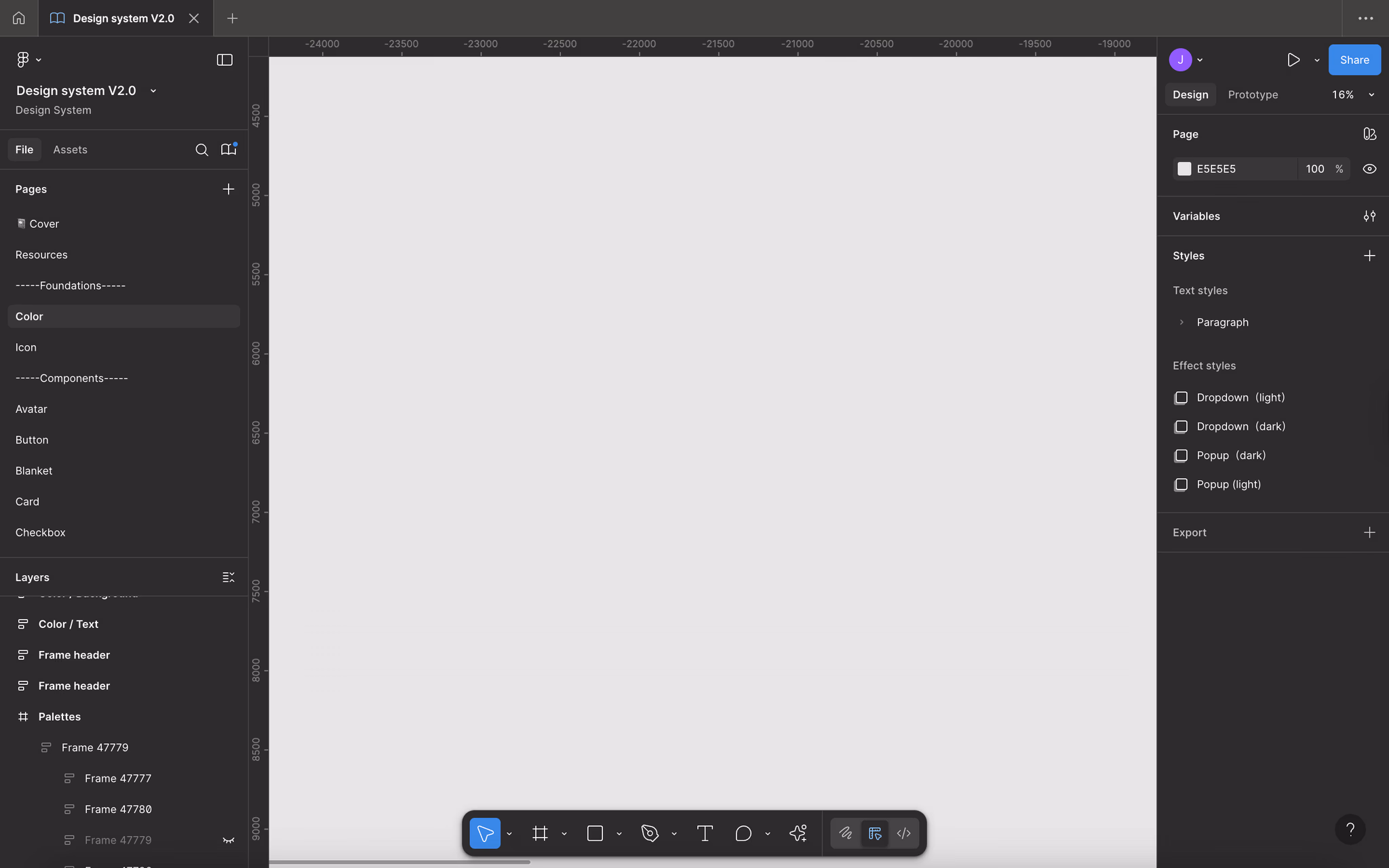
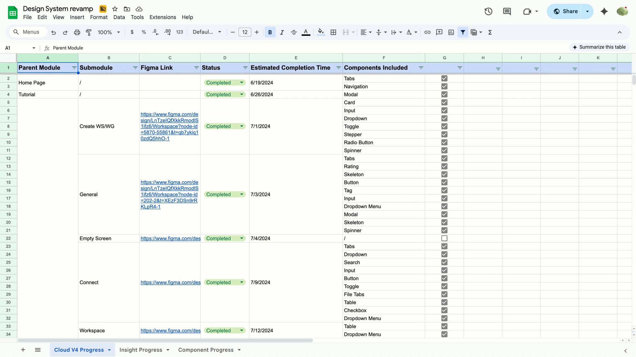
Before we built the system, I laid out an MVP roadmap with clear scope, owners, and weekly milestones. It aligned design, engineering, and product on what we would ship first—and what we would intentionally defer—so the rollout didn’t compete with ongoing feature delivery. The shared tracker kept progress visible and decisions accountable, which reduced coordination overhead and helped the team move in sync.
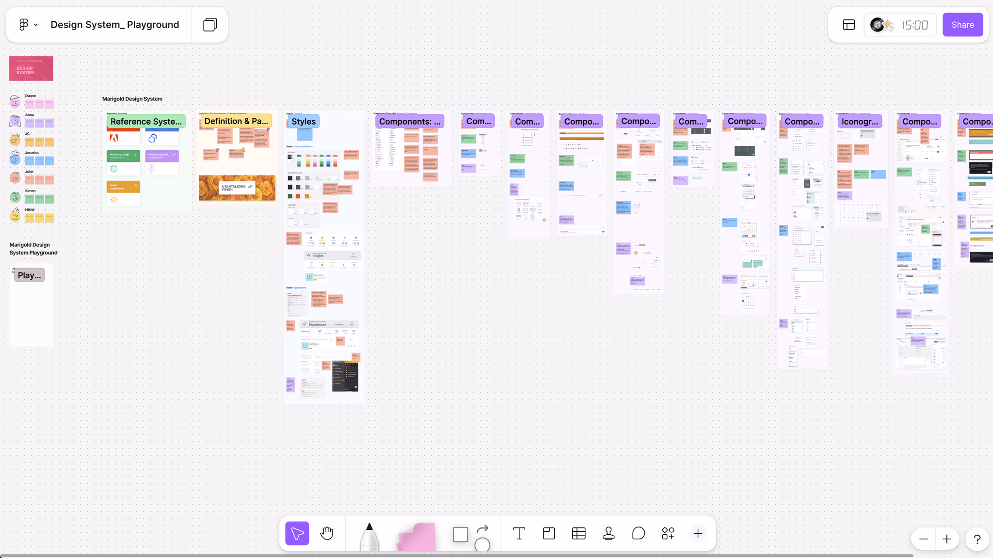
05 / Component audit
Audit research, scaled with AI
We audited components across TigerGraph products to capture real use cases and understand how the same function was implemented under different workflows—what it looked like, how it behaved, and where it diverged. AI helped us synthesize the volume: it clustered similar examples, highlighted recurring inconsistencies (styles, state coverage, interaction behaviors), and summarized the different requirements teams had for the “same” component. The outcome of this phase was evidence—clear problem signals and shared understanding—so we could move forward with confidence.
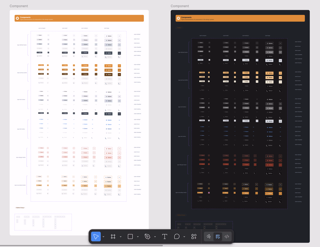
06 / Standards
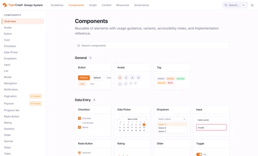
From audit to standards
Once the audit mapped what was shared and what diverged, we shifted from “inventory” to “standardization.” We grouped similar components into families, defined what must be consistent across products, and what can remain flexible per workflow. Because the scope was a full component revamp, we also set a shared build standard and assigned owners—so multiple designers could rebuild in parallel without creating new drift.

07 / System foundation
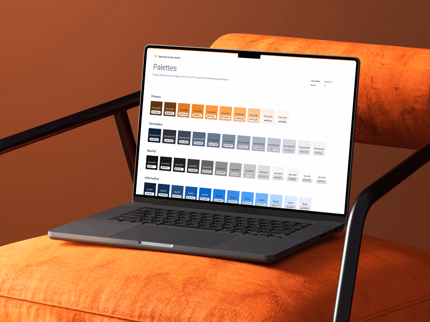
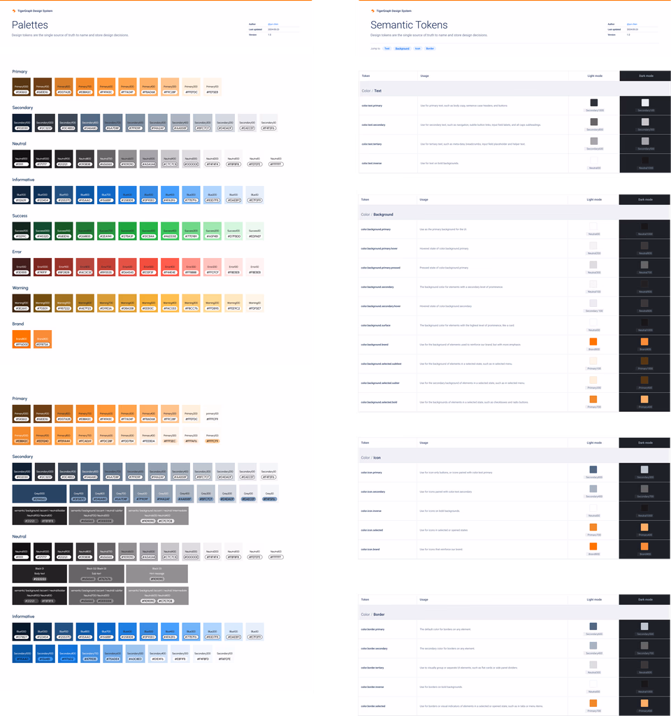
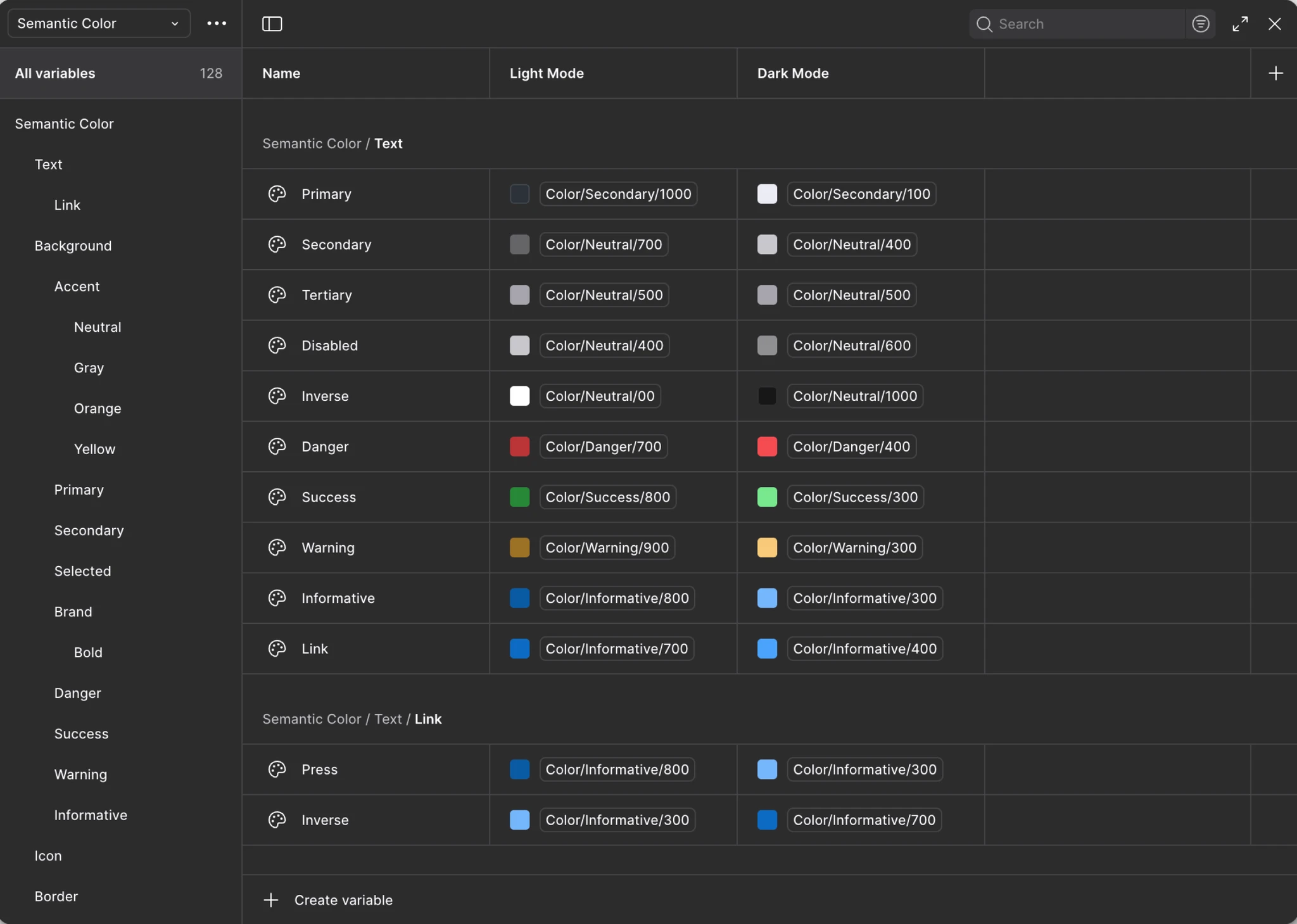
Design Tokens as a single source of truth
TigerGraph ships across multiple products, so UI decisions can’t live inside individual components or files. We built design tokens as a shared semantic layer for color, spacing, typography, and states, so changes scale across products instead of being repeated component by component.
AI sped this up by normalizing naming and flagging duplicates and mapping conflicts, then we reviewed and locked the final taxonomy as the source of truth.
color.orange.800Raw valuesurface.brand.contrastIntent, not a hexbutton.primary.pressed+ Buttoncheckbox.selected✓ LabelOne value can drive multiple components without recreating decisions.
08 / Theme architecture
One design, two themes
With tokens in place, light/dark mode became a switch—not a second design. We designed once, and theme mappings handled color and contrast across products, so teams didn’t maintain two sets of UI.
It gave teams a reliable way to support different environments and preferences, while keeping the system clean and scalable.
09 / Graph visualization
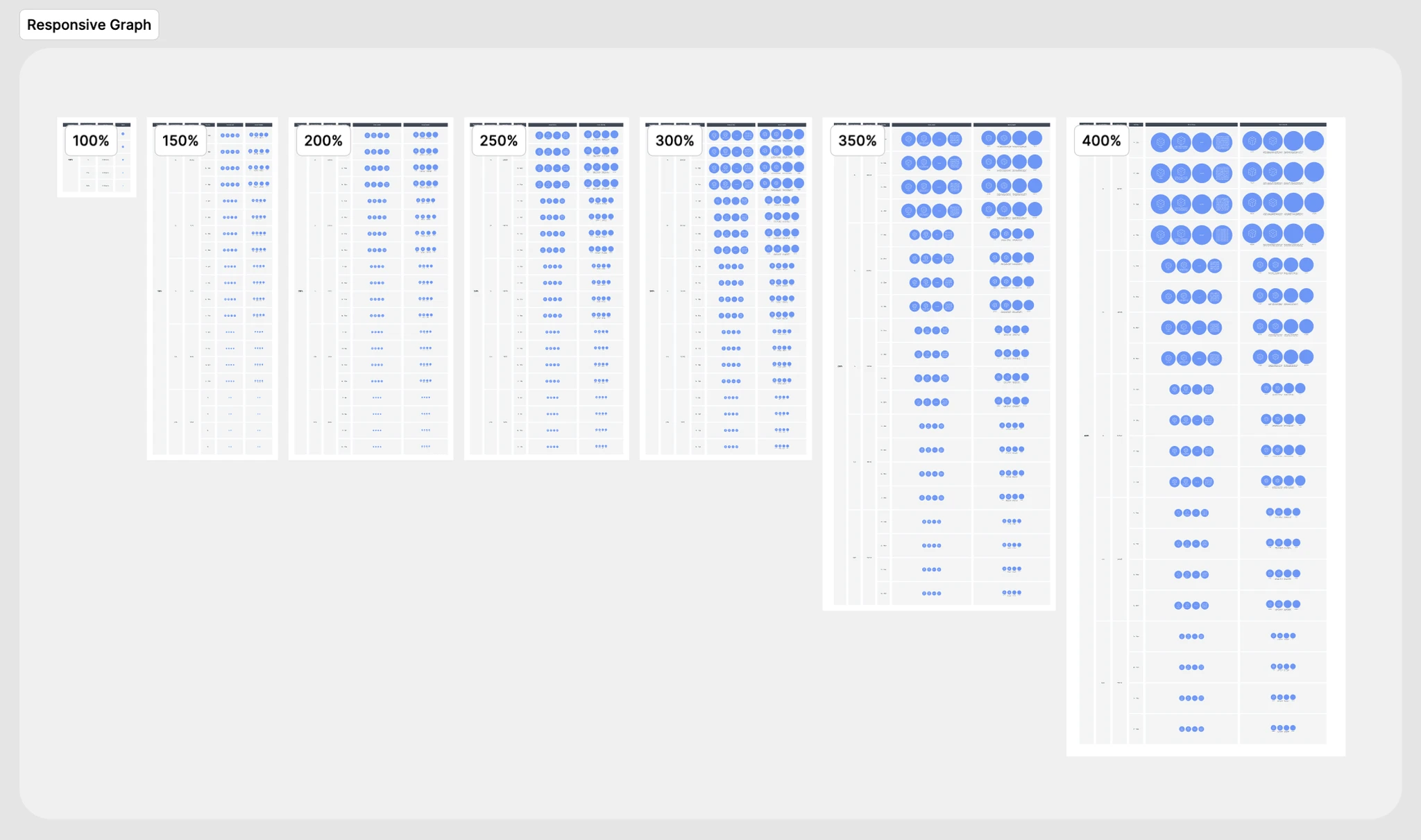
Graph visualization, standardized
In the audit, graph visualization stood out as a system-level inconsistency: the same nodes and connections could look and behave differently across products, and labels often became unreadable at certain zoom levels.
We brought these graph primitives into the design system as first-class components, standardized their key states, and defined zoom-based rules for sizing and label display—so graph information stays legible and interactions stay consistent everywhere.
10 / Accessibility
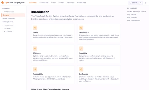
Built-in accessibility, not a patch
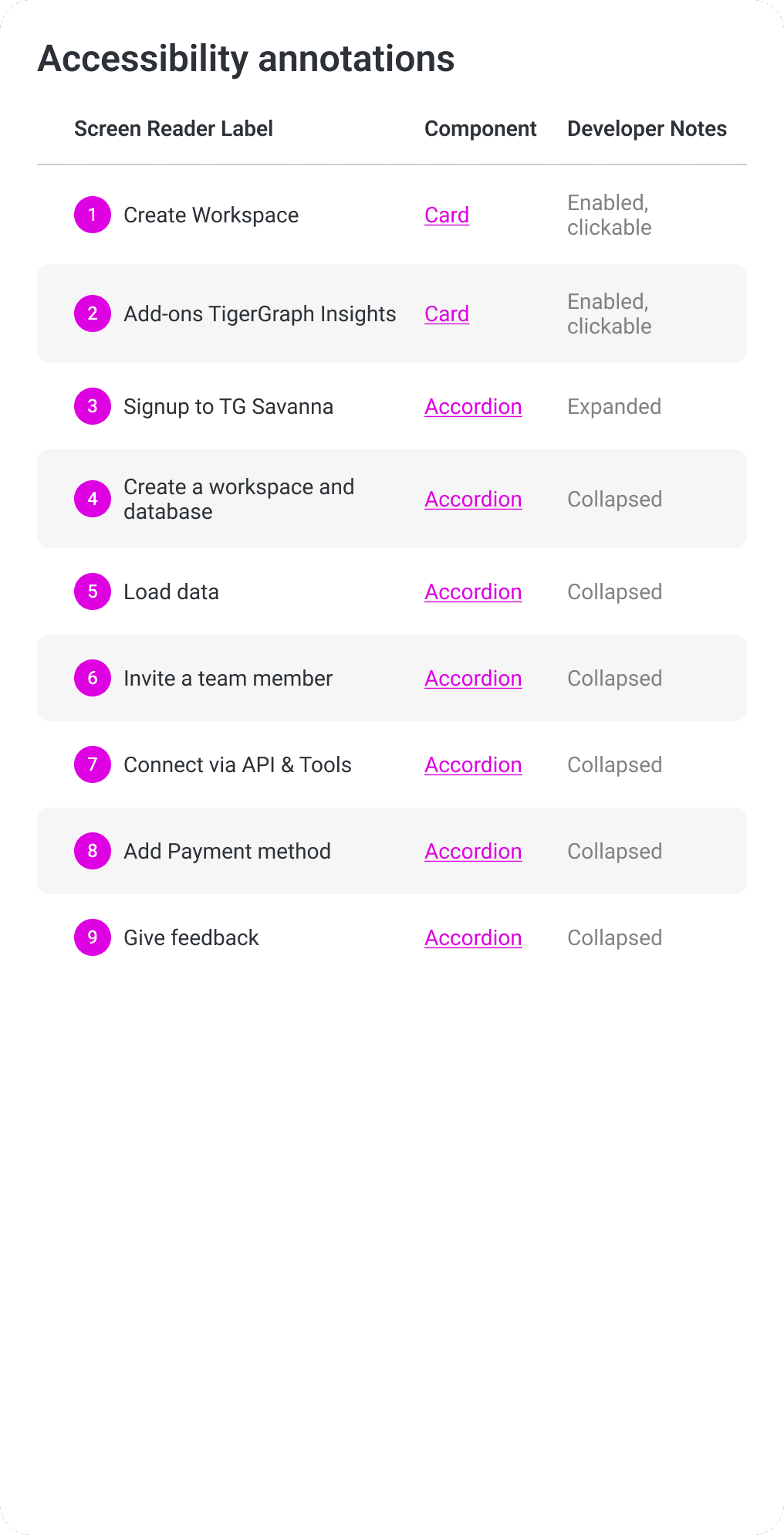
Accessibility was built into the system as “default behavior,” not a QA fix at the end. As we rebuilt components, we designed for responsive layouts, defined keyboard interactions and focus order, standardized focus states, and added screen-reader labels/roles—then verified color contrast with WCAG checks. To make handoff reliable, we also shipped accessibility annotations so engineers could implement the same intent consistently across products.
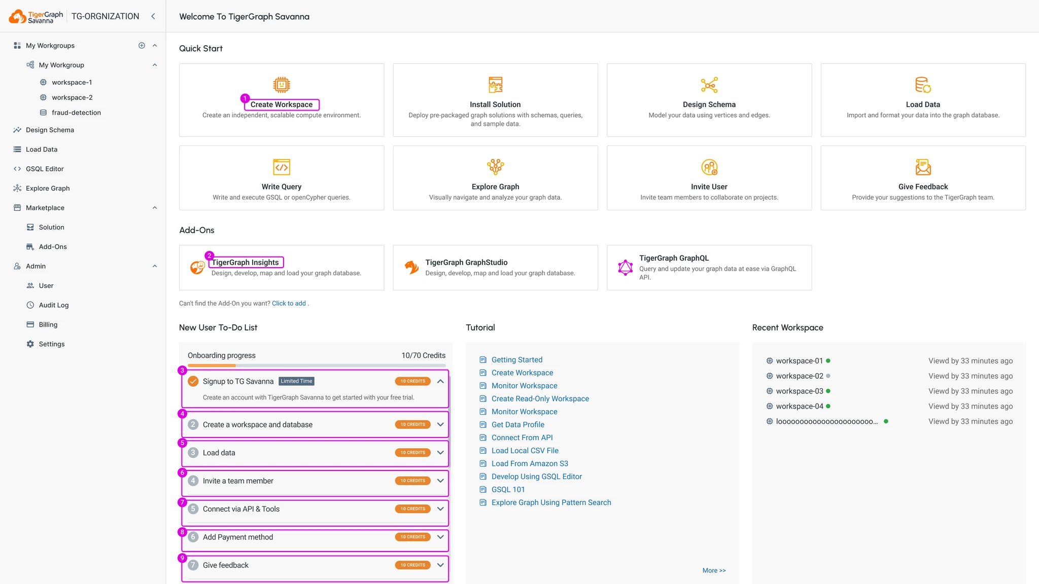
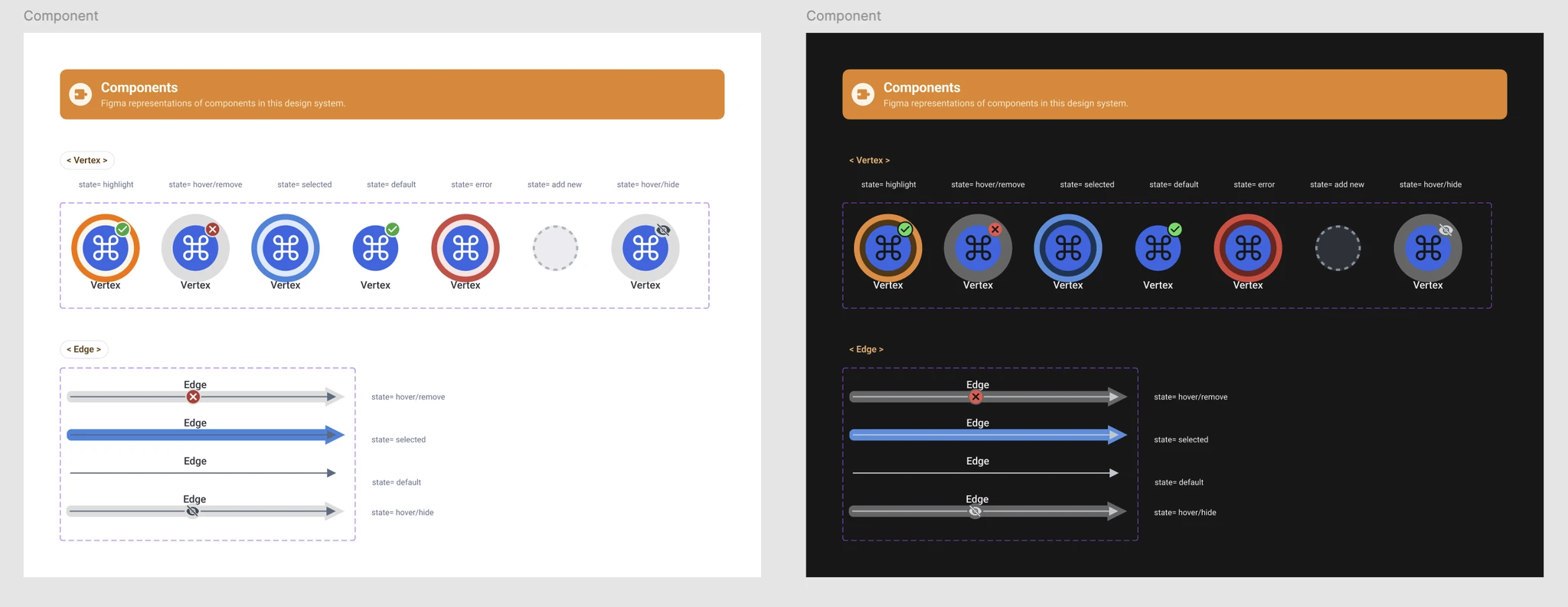
One shared pattern, with its permitted states made visible.


11 / Documentation
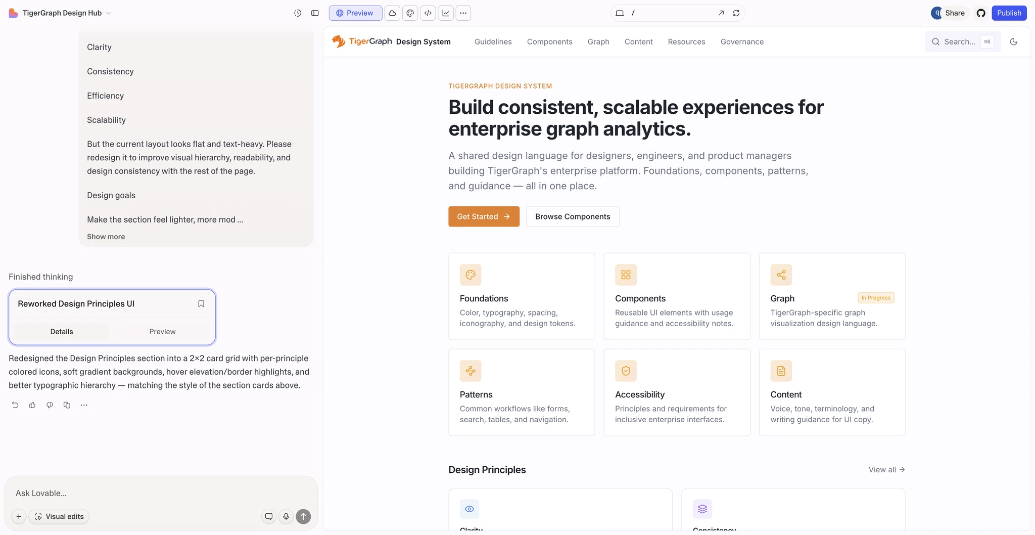
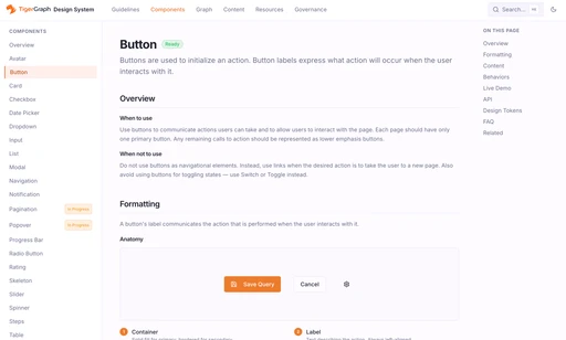
AI-accelerated documentation
A design system doesn’t land until teams can find answers on their own. We used Lovable to build the documentation site and populate it with usable guidance—all within a few days—covering what each component is, when to use it, edge cases, and accessibility notes. That speed removed tribal knowledge, made adoption easier, and closed the loop from building the system to getting it used.
12 / Result
Result
We shipped the first phase of the TigerGraph Design System as shared infrastructure across products—tokens, components, themes, accessibility, and documentation that teams could self-serve.
The impact showed up in day-to-day delivery: less repeated design work, fewer visual regressions, faster design–dev handoff, and a growing set of standardized components that teams could reuse with confidence.
13 / Iteration
Iteration & Learning
Building the design system taught me that the hardest part isn’t creating components—it’s creating the system that keeps them evolving.We introduced lightweight feedback channels, regular cross-team reviews, and update walkthroughs so the system could improve continuously as products shipped.
The biggest takeaway: a design system scales not through more components, but through clear ownership, simple processes, and documentation that teams actually use.
.say hello