U.S. News Money
Mortgage Quick Fill
U.S. News used mortgage calculators to help users estimate monthly payments and connect high-intent homebuyers with lender options. When I joined the project, only 6.4% of users completed the flow and clicked into a lender path.
I led the redesign from a traditional calculator into a guided estimate experience, using AI-assisted exploration, research, and prototyping to help users get to a useful estimate faster while keeping financial inputs structured, visible, and editable.
Time
2024
Role
Design Owner
Tools
Figma, ChatGPT, Claude, UserTesting, Miro, Analytics

01
Reframing a mortgage calculator into a 30-second guided estimate experience.
Simon Dai - Portfolio Case Study


BASELINE
Next-Action Rate
+0%
+0%
02

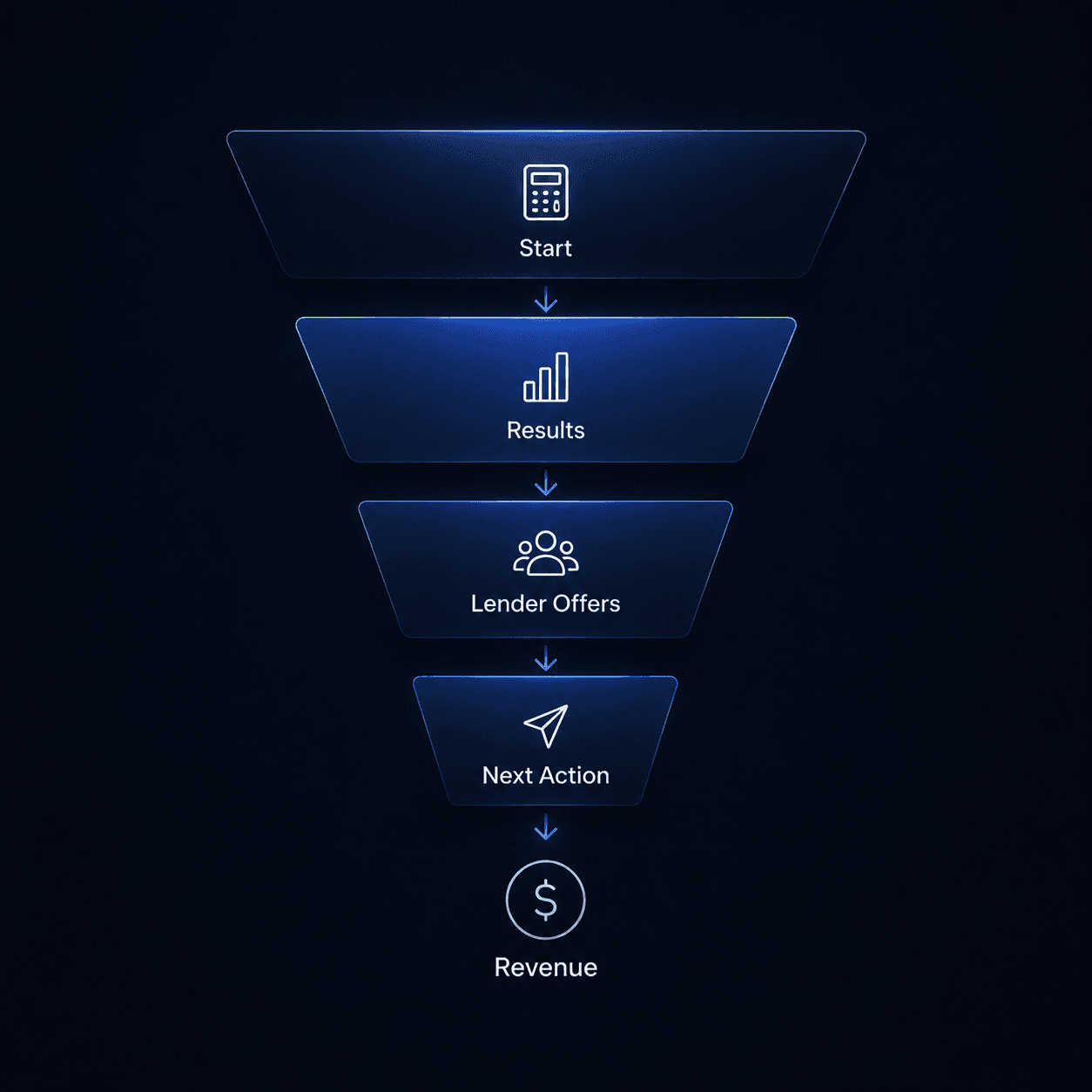
This was an ad-supported fintech funnel: when users reached a useful estimate, they were more likely to compare rates, view lender offers, and take a monetizable next action.
Design clarity directly affected business conversion.
03
USER
Get a useful mortgage estimate in 30 seconds without requiring financial expertise.


Fast
Simple
Confident
04
The Original Calculator Experience
The original calculator was functional, but it asked users to complete a dense form before they could see a useful estimate.
Users had to invest effort before understanding the value.
Try the Prototype ↓
Where users dropped off
I paired product analytics with the original experience to understand where friction appeared in the journey.
46%
Started entering info
21%
Completed required fields
18%
Reached result screen
05
The first fix wasn’t enough
After early user interviews and usability tests, we decided to add more guidance around confusing mortgage inputs. The hypothesis was simple: if users understood the fields better, more of them would complete the calculator.
Why this decision
Users were hesitating around unfamiliar terms and exact financial inputs, so the first fix focused on reducing confusion through tooltips and clearer visual explanations.
Result
The improvement was small. Tooltips helped users who were already committed, but they did not reduce the larger barrier of time, effort, and trust before users started.
Try the Prototype ↓
46% → 48%
Started calculator
+2 pts
21%→ 23%
Completed inputs
+2 pts
18% → 20%
Reached result screen
+2 pts
6.4% → 6.8%
Took next action
+0.4 pts
06
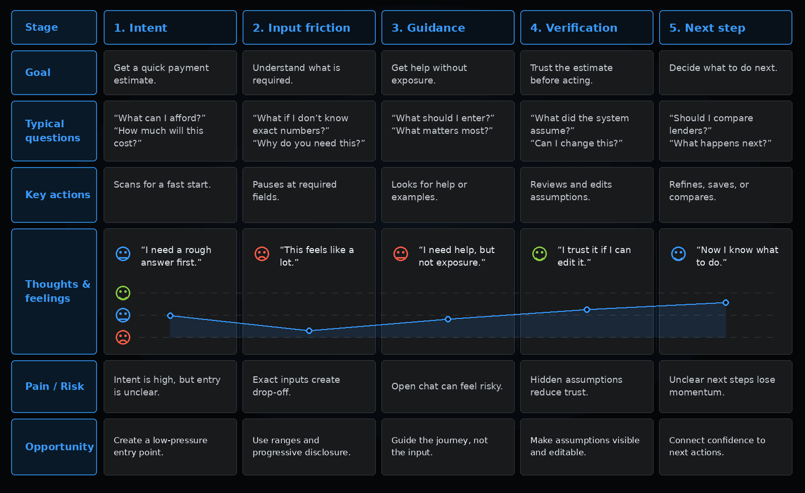
The real barrier wasn’t the fields
07


08
From research signal to success criteria
After research, I aligned Product, Design, Engineering, and leadership around one focused strategy: keep the calculator logic intact, redesign the intake layer, and measure success by result-screen reach and next-action rate.
User success
Users can reach a useful estimate faster, with less uncertainty and fewer sensitive inputs upfront.
Product success
More users complete the calculator and reach the result screen with enough confidence to continue.
Business success
The experience increases high-intent next actions, including refining, saving, comparing, or viewing lender offers.
Delivery success
The solution improves the intake layer without requiring a rebuild of the core calculation engine.
09
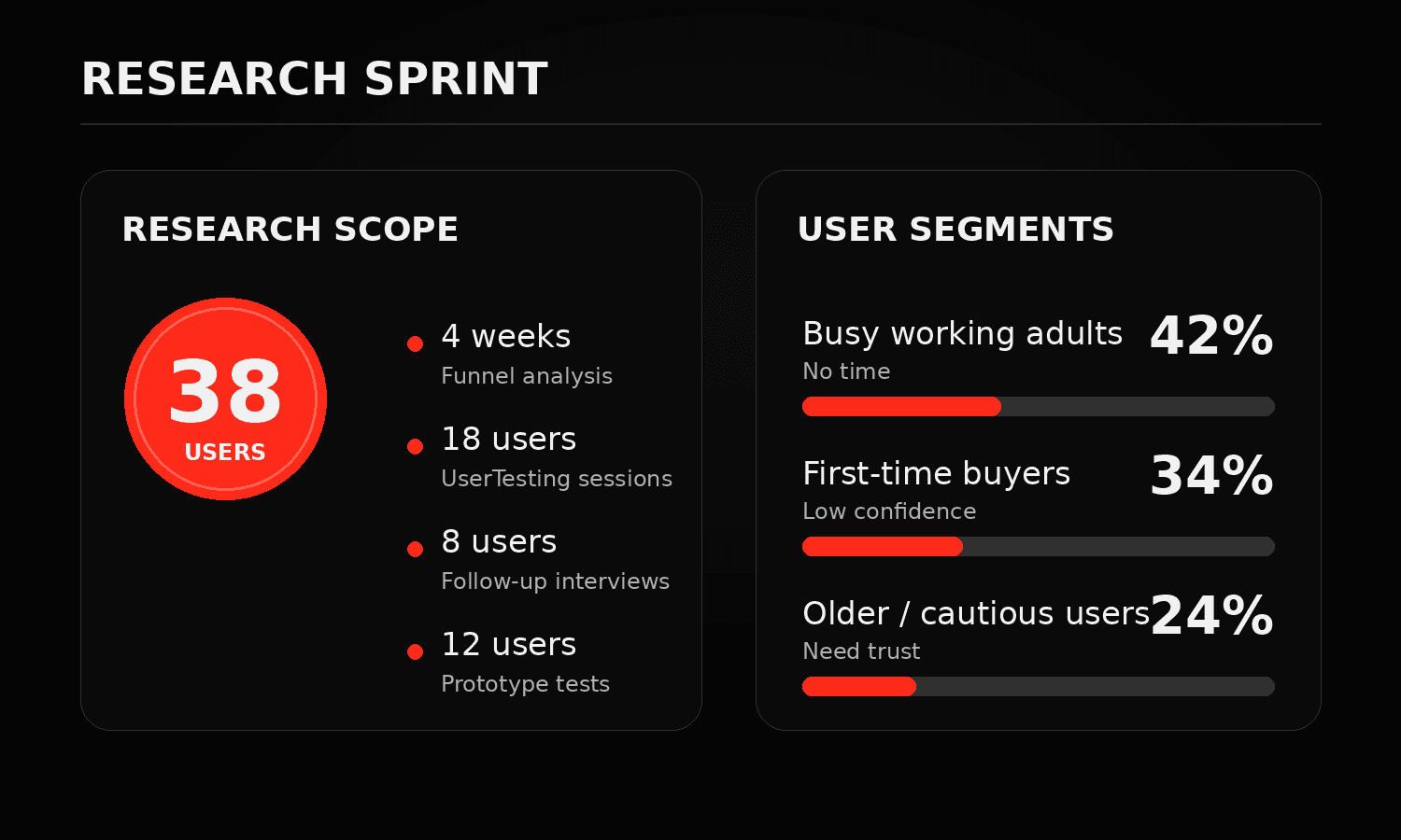
Prototype signals (12 tests + 8 interviews)
Preferred guided help
75%
Understood assistant
83%
Comfortable sharing exact income / debt
33%
Wanted review / edit
92%
Raised privacy concerns
50%
Design direction
Keep the guidance. Structure the input.
AI could guide the experience, but sensitive financial inputs needed to stay structured, visible, and editable.
10
Design implication
AI should guide the journey, not own the conversation — using a structured flow where guidance, input, and control happen at the right moments.
11
We created a guided entry point that helped users estimate faster, understand assumptions, and stay in control before calculating.

12
Decisions that changed the product
The final solution came from four product decisions: where AI should appear, how much information users should provide upfront, how much control they needed, and what we could ship without rebuilding the core calculator.
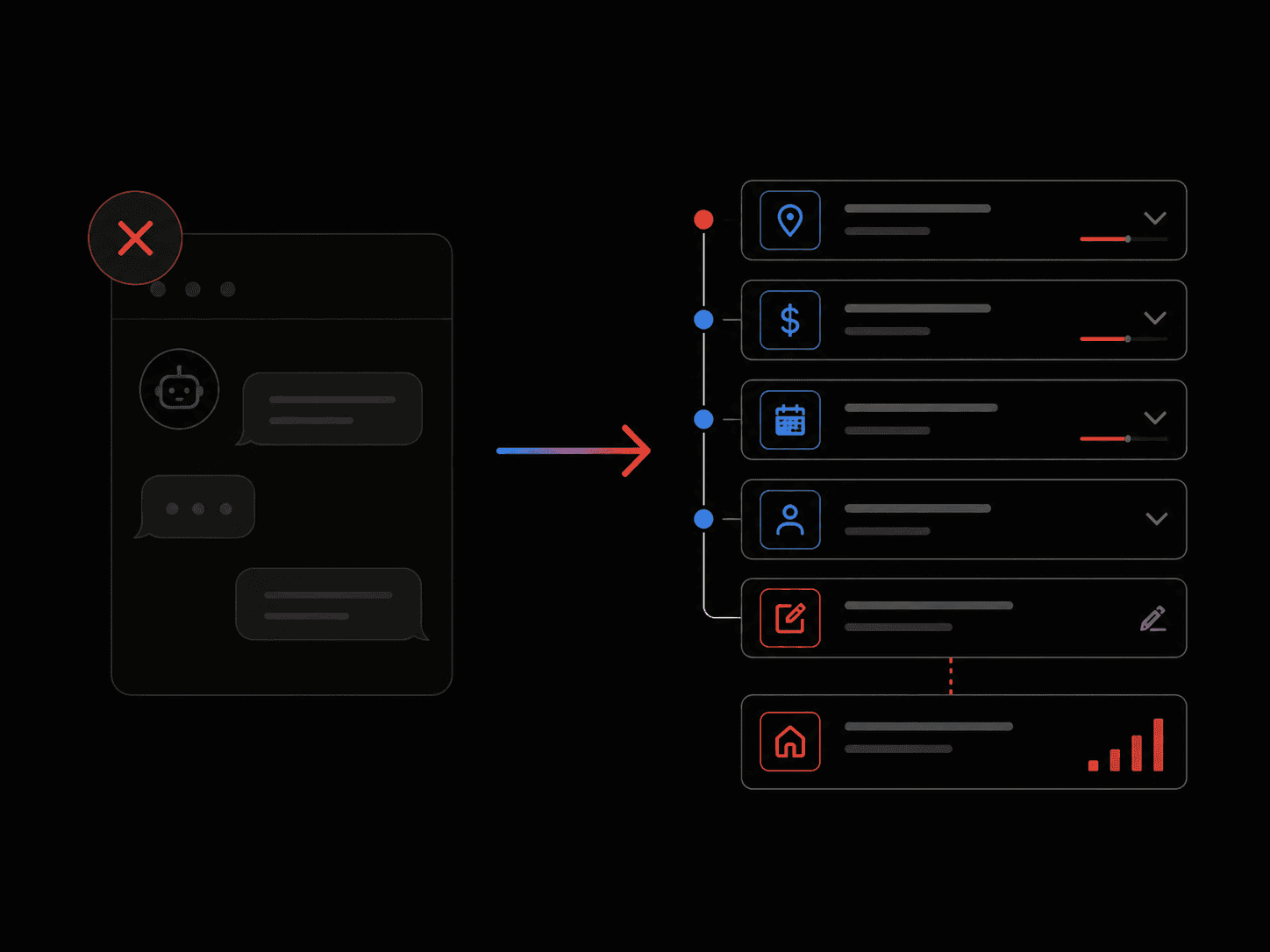
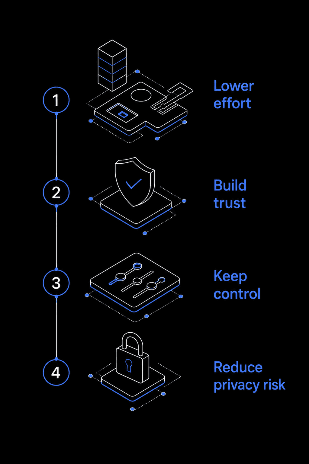
Kill the Chatbox
Users liked guidance, but 50% raised privacy concerns. We kept the intelligence and removed the conversational interface.
Use Ranges First
Exact income and debt fields made users hesitate. Range-based questions made the first step feel easier and safer.
Show Editable Assumptions
AI could suggest defaults, but users needed to review and edit before trusting the estimate.
Keep the Core Calculator
We redesigned the intake layer without rebuilding the calculation engine, which made the solution faster to ship.
13
From 6.4% to 13.8%
The final Guided Quick Fill prototype gave users a lighter way to start, review assumptions, and reach a useful estimate before taking the next step.
Try Final prototype ↓
46% → 48%
Started calculator
+2 pts
21%→ 23%
Completed inputs
+2 pts
18% → 20%
Reached result screen
+2 pts
6.4% → 13.8%
Took next action
+0.4 pts
14